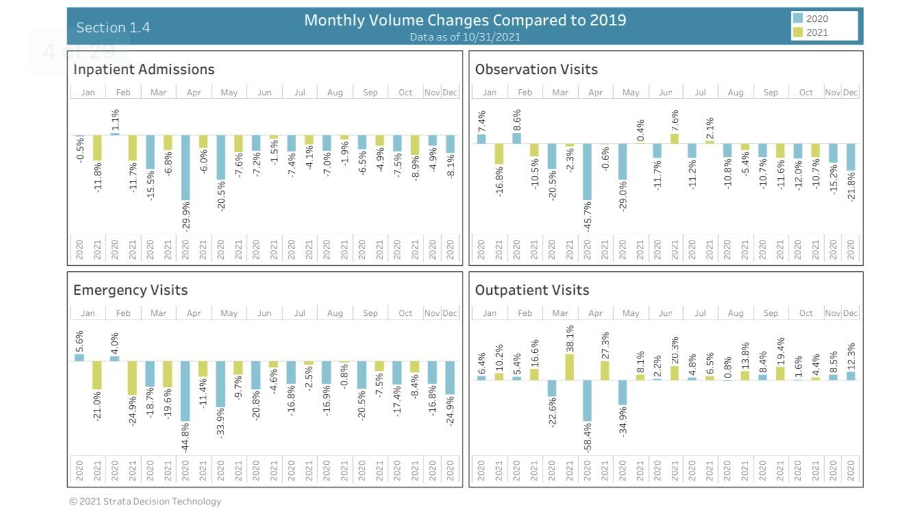
This graph, ripped straight from Phil Kerpen’s Twitter, is one of the most eye-opening I’ve ever seen: through a comparison, we see that 2020/2021 hospitalizations are far lower than 2019. The big lie has been that hospitals have been pushed to the brink, are on the verge of collapse, are “buckling under pressure”, and many other melodramatic turns of phrase. These are all different ways of lying about the one fact that was really the precursor to lockdowns to begin with: that hospitals would be overwhelmed by patients amid a pandemic. No one looking at the graph would’ve known that a pandemic had taken place. And to think, for this the world was brought to the brink of a total, self-inflicted collapse, one that we are still witnessing unfold.

